Email communication is a timeless and effective tool in both personal and professional settings. Even as technology evolves, the importance of delivering clear and concise messages remains paramount. An often overlooked aspect of email design is font selection. The importance of choosing the correct, email safe fonts should not be underestimated. Keep reading to discover why.
Why Use Safe Fonts for Emails

Alt Text: An email app has an empty inbox.
The term ’email safe fonts’ refers to those typefaces that are commonly installed across most devices, be it a desktop computer, a tablet, or a smartphone. This widespread availability ensures that your emails appear the same, regardless of the device your recipient is using.
Choosing email-safe fonts guarantees that your emails remain readable and maintain your desired aesthetic. While ornamented and uncommon fonts may seem appealing, these are unlikely to appear the same across all devices, leading to unexpected and undesirable text displays.
Selecting a font may seem trivial but consider this: miscommunication can easily occur if your message is unreadable. Poor font choices could lead to your emails not having the intended effect or even being disregarded.
Criteria for Choosing the Right Email Safe Fonts
Now that we understand why email safe fonts are important, how do we choose the right one for our needs? The first thing to consider is readability. The font needs to be easily read across all devices and screen sizes.
Secondly, consider how well the font translates your brand identity. Is it professional enough for a formal business email? Is it friendly and casual for a fun and engaging newsletter? Balance your brand persona with the font’s readability.
Accessibility is another important criterion. A good font should be legible even for those with vision impairment or dyslexia. Avoid overly decorative or serif fonts as they can be harder to digest.
A Brief Comparison of Popular Email Safe Fonts
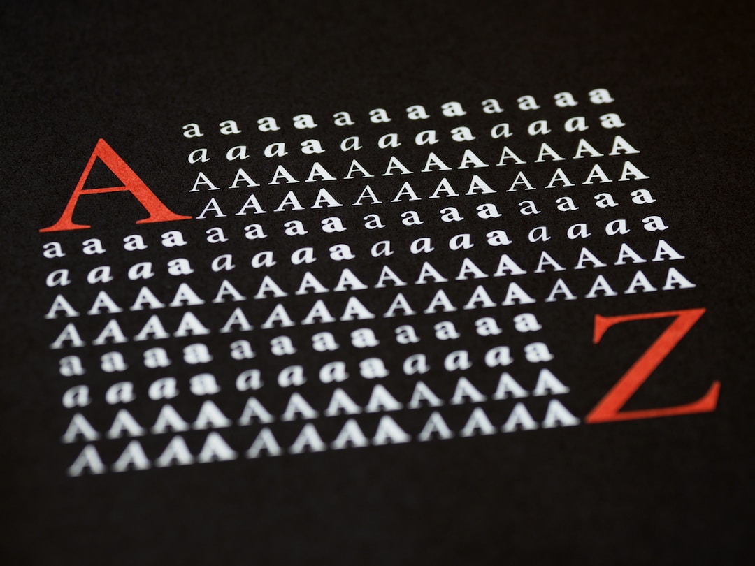
Alt Text: A font displayed in different formatting.
Numerous fonts are categorized as ’email safe’. Among these, some are more popular due to their versatility and universal compatibility. Helvetica, Arial, and Times New Roman are classic choices and render reliably on all devices.
Helvetica is a modern, sans-serif font universally accepted by most email clients, making it a safe option. Arial, closely resembling Helvetica, is a standard font on all Windows and Mac systems. It is less commanding than Helvetica, providing a friendly and simple appearance.
As for Times New Roman, its familiarity with being a standard in the publishing industry makes it an easy-to-read font. However, it may be considered boring and dated compared to other modern fonts available.
Other reliable fonts include Courier, a mono-space font that reflects typewriter style for a retro feel, and Verdana, a sans-serif font with a wider character design that increases readability on smaller screens.
Making the Most of Your Chosen Font in Email Marketing Strategy
Once you have selected the perfect email-safe font, it’s time to make the most of it. This means maintaining consistency in font use to build and reinforce your brand image.
Consider using the chosen font across all your email communications, marketing materials, and even your website. This consistency enhances brand recognition and professional appearance.
Also, ensure that your email design complements your chosen font. Elements like color, size, and alignment are crucial factors in keeping your email visually appealing and effective.
Altogether, the importance of selecting the right email safe font goes beyond aesthetic appeal. It significantly impacts email deliverability, user experience, and ultimately, the success of your email communication or marketing campaign.
FAQs on Choosing the Right Email-Safe Fonts:
Why is choosing an email-safe font important for email communication?
Answer: Selecting an email-safe font ensures that your emails appear consistently across various devices, preventing unexpected text displays. This is crucial for maintaining readability and conveying your message effectively.
What are email-safe fonts, and how do they differ from other fonts?
Answer: Email-safe fonts are typefaces commonly installed on most devices, ensuring uniformity in email appearance. Unlike more ornate or uncommon fonts, email-safe fonts guarantee a consistent display, minimizing the risk of miscommunication.
What criteria should I consider when choosing an email-safe font for my emails?
Answer: Key criteria include readability across devices, alignment with your brand identity, and accessibility. The chosen font should be easily legible, match your brand’s tone (professional or casual), and be accessible to users with visual impairments or dyslexia.
Can you recommend some popular email-safe fonts and their characteristics?
Answer: Helvetica, Arial, and Times New Roman are popular email-safe fonts. Helvetica is modern and sans-serif, Arial is standard on Windows and Mac systems, while Times New Roman is a classic choice. Other options include Courier for a retro feel and Verdana for improved readability on smaller screens.
How can I ensure my chosen email-safe font contributes to my overall branding strategy?
Answer: Consistency is key. Use your chosen font across all email communications, marketing materials, and your website to enhance brand recognition and maintain a professional appearance. Ensure that your email design complements the chosen font in terms of color, size, and alignment.
What impact does the right email-safe font have on email marketing success?
Answer: The right email-safe font goes beyond aesthetics; it influences email deliverability and user experience. By choosing a font that is easily readable and aligns with your brand, you enhance the effectiveness of your email communication and marketing campaigns.
Leave a Reply